
Ah, the start of a new year—a time for fresh beginnings, ambitious resolutions, and a desperate attempt to undo the holiday season’s questionable food choices. But while you’re busy signing up for gym memberships you’ll forget about by February, why not focus on a transformation that actually sticks? Your home’s color palette!
Believe it or not, the colors around you do more than just look pretty—they can affect your mood, productivity, and even your appetite (yes, that explains why fast food chains love red). So, before you slap on another shade of “rental beige,” let’s dive into the emotional power of colors and how to make them work for you in 2025.
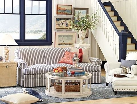
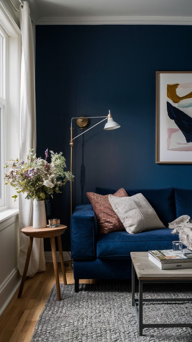
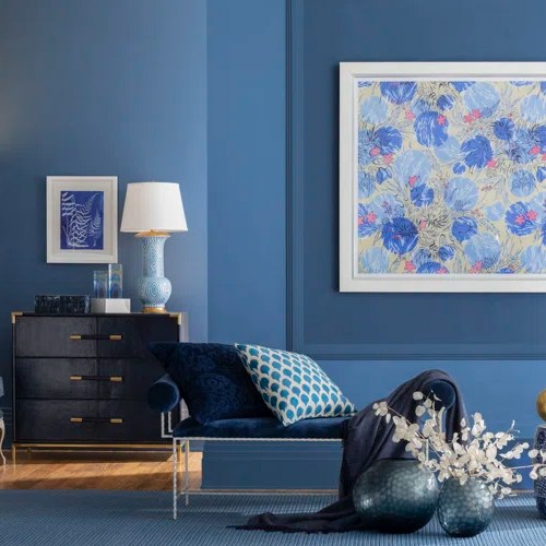
Blue: The Zen Master
If your new year’s goal is to stress less and sleep more, blue is your best friend. Known for its calming effects, shades of blue lower heart rates and promote relaxation—perfect for bedrooms, bathrooms, and anywhere you want to exude spa-like serenity. But beware: go too dark, and your room might start feeling like an underwater cave.
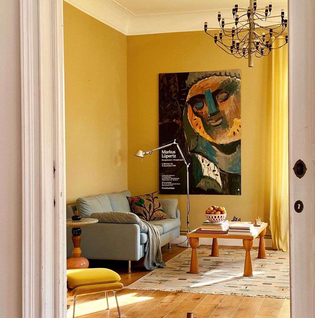
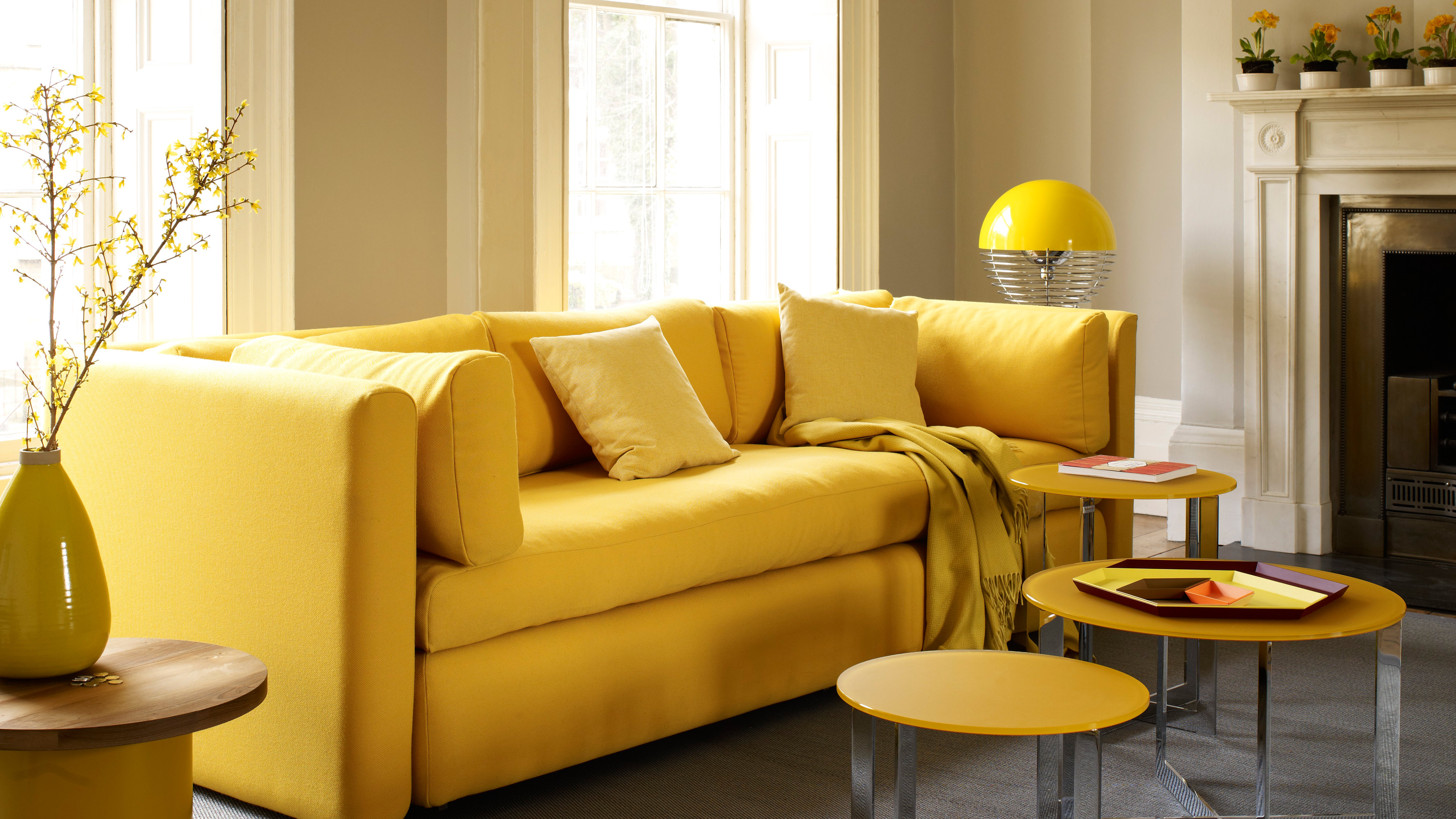
Yellow: The Morning Person of Colors
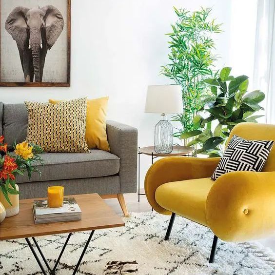
Want to wake up feeling energized? Yellow is like a cup of coffee in color form. It’s bright, cheerful, and screams optimism. Ideal for kitchens and home offices, a pop of yellow can boost creativity and positivity. Just don’t overdo it—unless you want your guests to feel like they’ve walked into a giant sunflower.
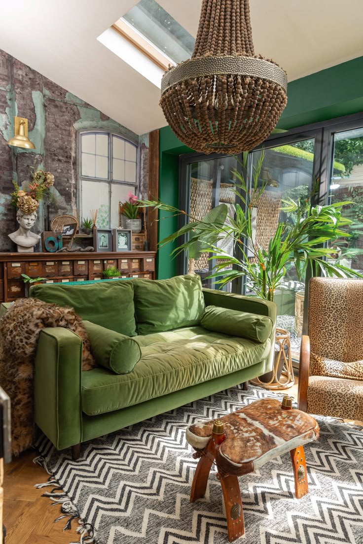
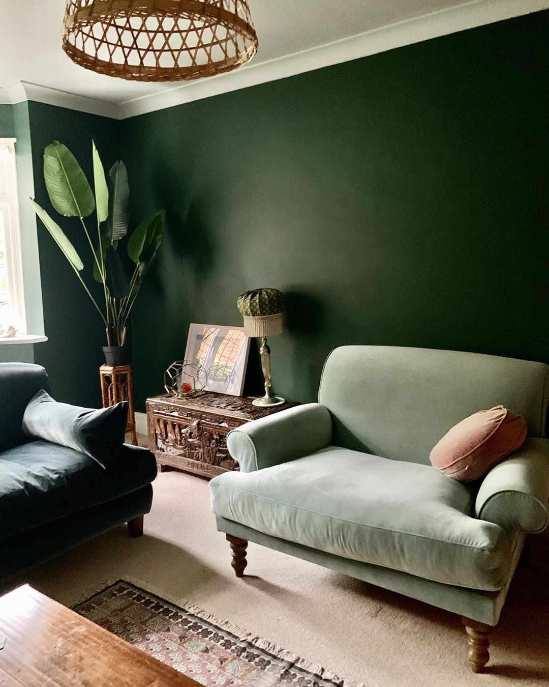
Green: Nature’s Therapy
Green is like a deep breath of fresh air—literally. Symbolizing balance and renewal, it’s the go-to color for biophilic design lovers. Whether it’s sage, emerald, or the trendy moss green, this shade works wonders in living rooms and study spaces, offering a grounding, earthy vibe. Bonus: it pairs effortlessly with natural wood and indoor plants.
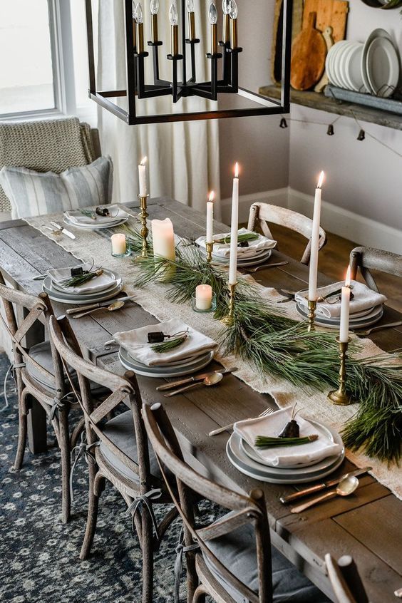
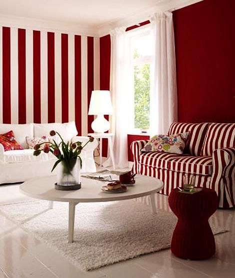
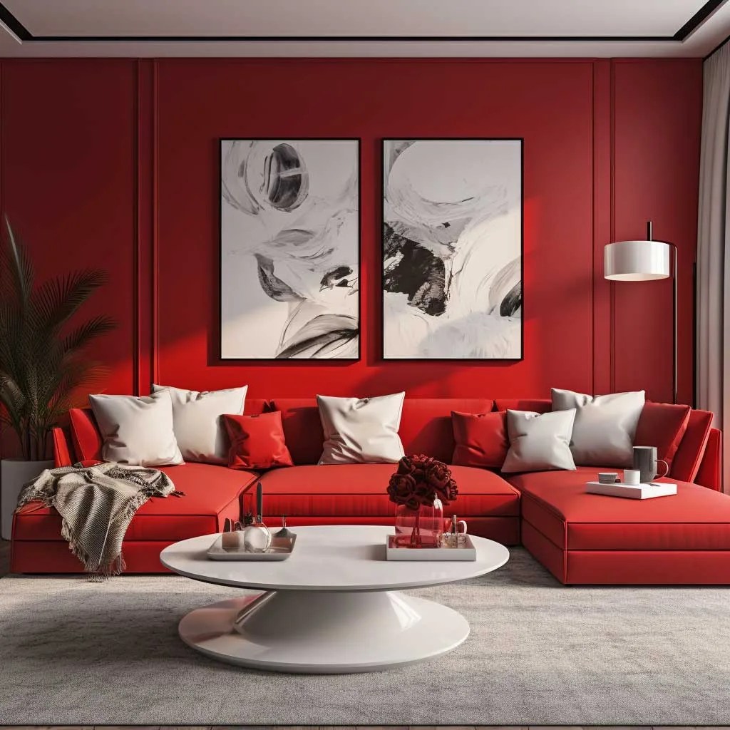
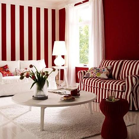
Red: The Drama Queen
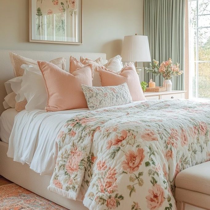
Red is bold, passionate, and the ultimate attention-seeker. While it’s perfect for dining areas (hello, increased appetite), using too much can make a space feel overwhelming. If you want a touch of drama without the emotional rollercoaster, try a deep burgundy or a subtle terracotta for warmth and sophistication.
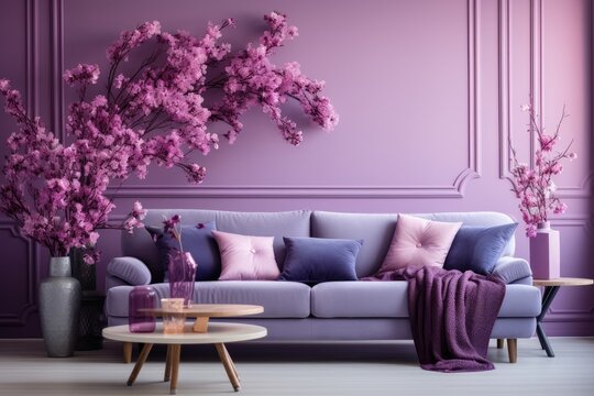
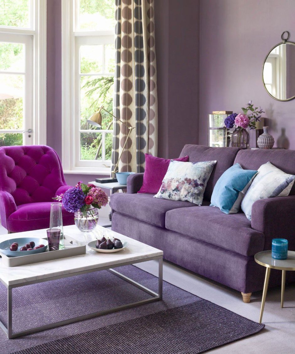
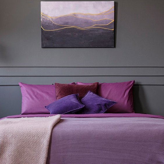
Purple: The Creative Genius
Ever noticed how purple is often associated with royalty, creativity, and mysterious fortune tellers? That’s because it sparks imagination and luxury. Lavender tones offer a soft, relaxing effect, while deep plum adds a moody elegance to bedrooms and lounges.
Unexpected Color Pairings for a Fresh Look
Now, if you’re ready to level up your color game beyond the usual neutrals, here are some bold, yet surprisingly harmonious combinations for 2025:
Peach & Forest Green – A playful mix of warmth and nature that feels both fresh and cozy.
Mustard Yellow & Charcoal Grey – A chic, modern duo that brings in both vibrancy and grounding tones.
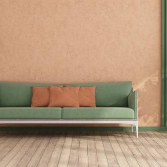
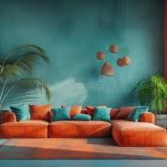
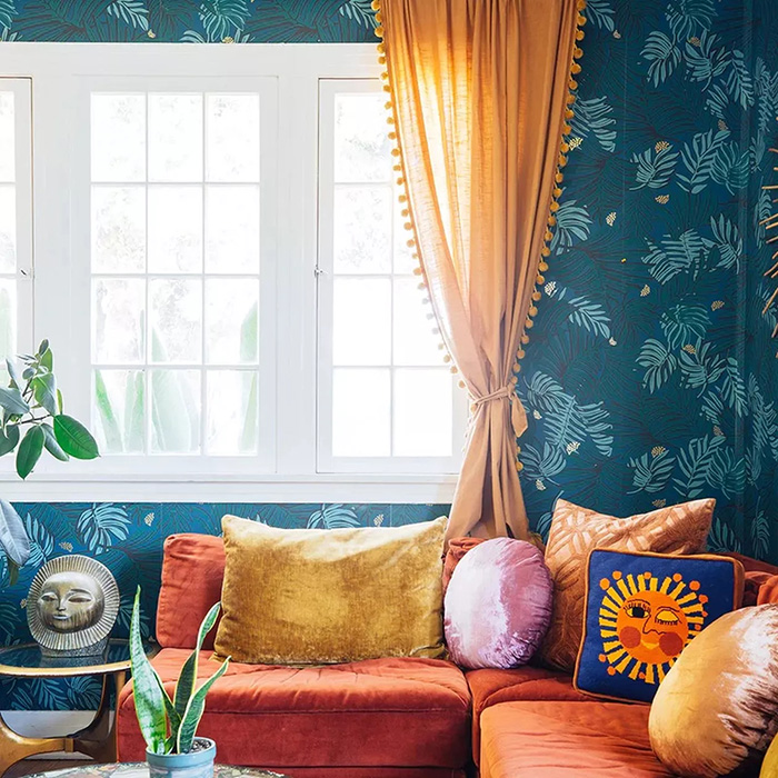
Deep Teal & Burnt Orange – The perfect mix of cool and warm, giving a vintage-meets-contemporary aesthetic.
Soft Lavender & Olive Green – An unexpected pairing that balances relaxation with a pop of organic energy.
An Expert’s Take: What’s Trending in 2025?
To get the inside scoop on the year’s hottest color trends, we spoke to Samantha Brightwell, an interior color specialist and self-proclaimed “paint whisperer.” Here’s what she had to say:
Q: What’s the biggest color trend we’ll see in 2025?
Sam: “People are moving away from stark minimalism and embracing rich, cozy colors. Think warm neutrals like clay, honey, and muted terracotta. These shades bring a sense of nostalgia but still feel fresh and inviting.”
Q: Any surprising colors making a comeback?
Sam: “Oh, absolutely! Plum and deep indigo are making a big return. We’re also seeing a rise in moody browns—yes, brown! Done right, it looks incredibly sophisticated.”
Q: What’s one color mistake people should avoid?
Sam: “Going overboard with one color. Balance is key! If you love a bold hue, use it as an accent rather than drowning your space in it. And please—let’s retire overly bright, clinical whites. Your home isn’t a hospital.”
Whether you’re revamping your space or just swapping out some throw pillows, color is a powerful tool that can totally shift your home’s energy. So, why not embrace the new year with a new mood? After all, if changing a wall color can help you feel happier, more relaxed, or even more productive—that’s a resolution worth keeping.
Now, excuse us while we go debate whether deep teal or burnt orange is the better life choice. 🎨😉
~Manzil e Meena

Leave a reply to Scott Dubois Cancel reply